The Brief
I was hired on a short term contract with Adevinta help their Data access team in Barcelona to improve their internal tool. This tool allowed organization wide permission based access to datasets collected across all of Adevinta’s Digital Assets.
The Existing Platform
the existing tool was ok, It functioned well the Code was tidy. However it looked very “Bootstrap” and was had a confusion of links and menus that was hard to reason.
The base design tokens where fine. The font was nice, but needed word on the weights and sizes of the headers. The shade of blue was a nice touch.
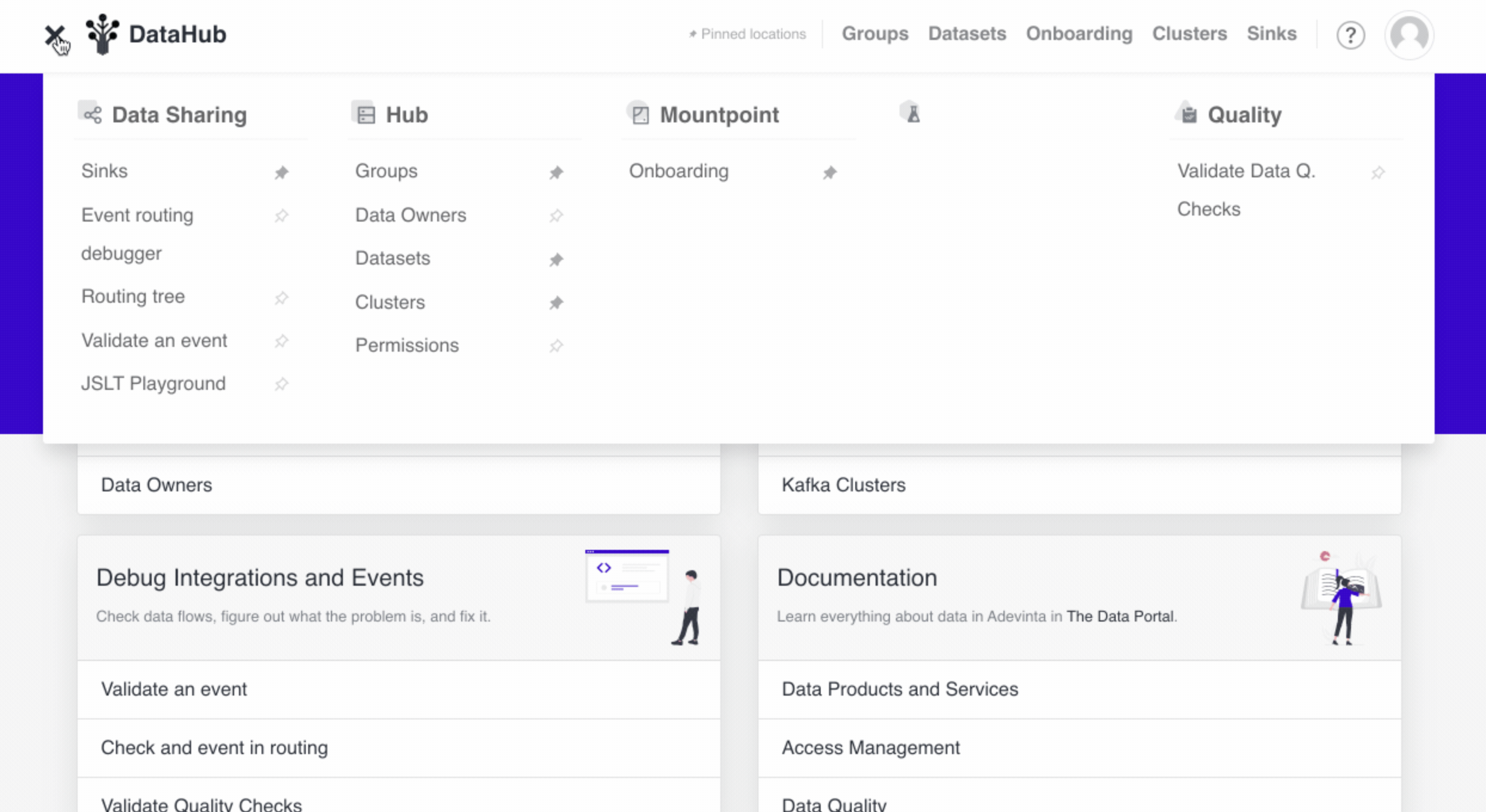
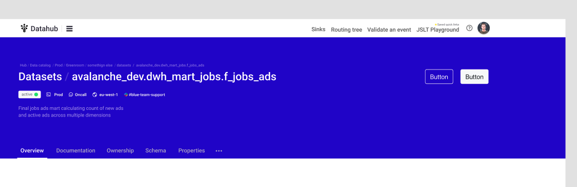
Main Menu Redesign
The main menu was too verbose and lacked context. The search was also a bit hidden.
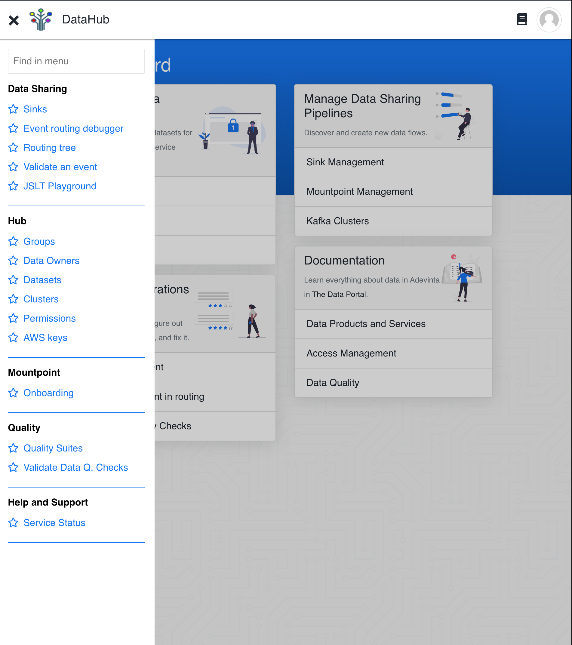
I moved this the search into the page and moved the main mane into a vertical header. Custom making some two tone icons. to distinguish each section.
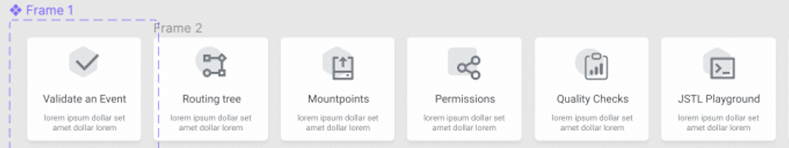
Custom Tool Cards
Each feature in the platform was essentially its own tool. That would be utilized differently by different teams across the organization. To account for this and give them a visual trigger for the teams to find them. I created Tool Cards. Which matched the icons from the Header. This gave each tool its own identity within the platform. Making it easier to find when glancing.
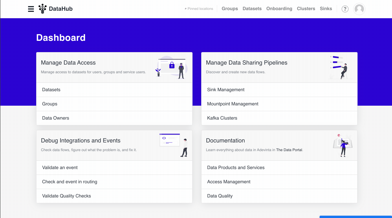
Page header
Along side the new main menu we defined a structure and style for page headers across the platform. This provided a common structure regardless of the content. With
- Action buttons top left.
- Small breadcrumb above page title
- Page title would follow the format of “feature / page” for better UX regarding the tool in use.
- Status & Meta Information
- Nested pages submenu
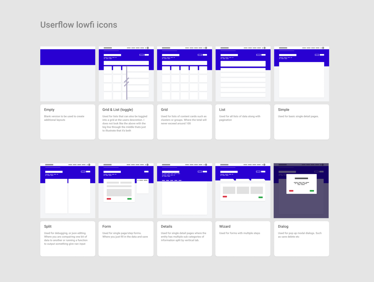
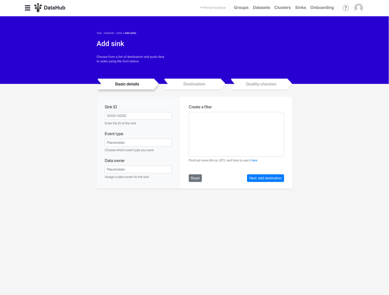
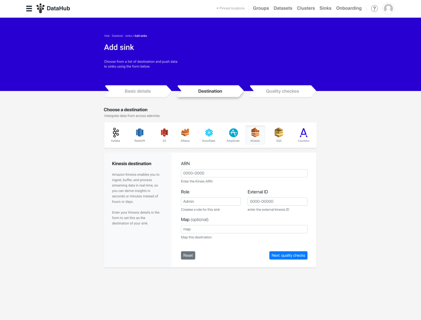
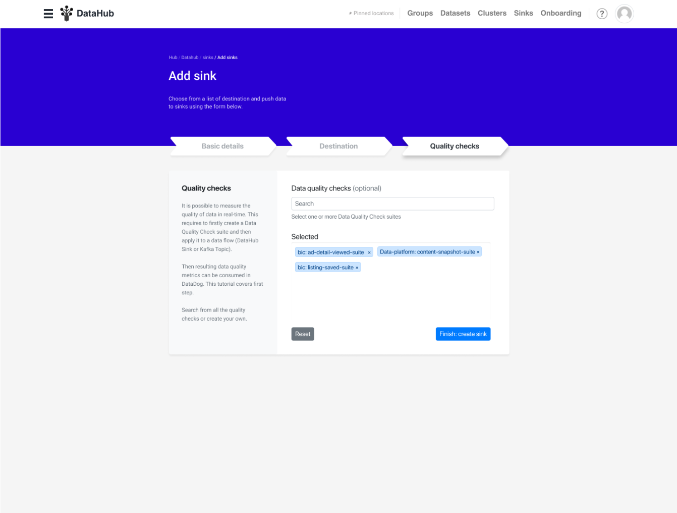
Standard layouts
I also defined a set of layouts that could be used depending on the page. Such as form stepper “wizrard”.
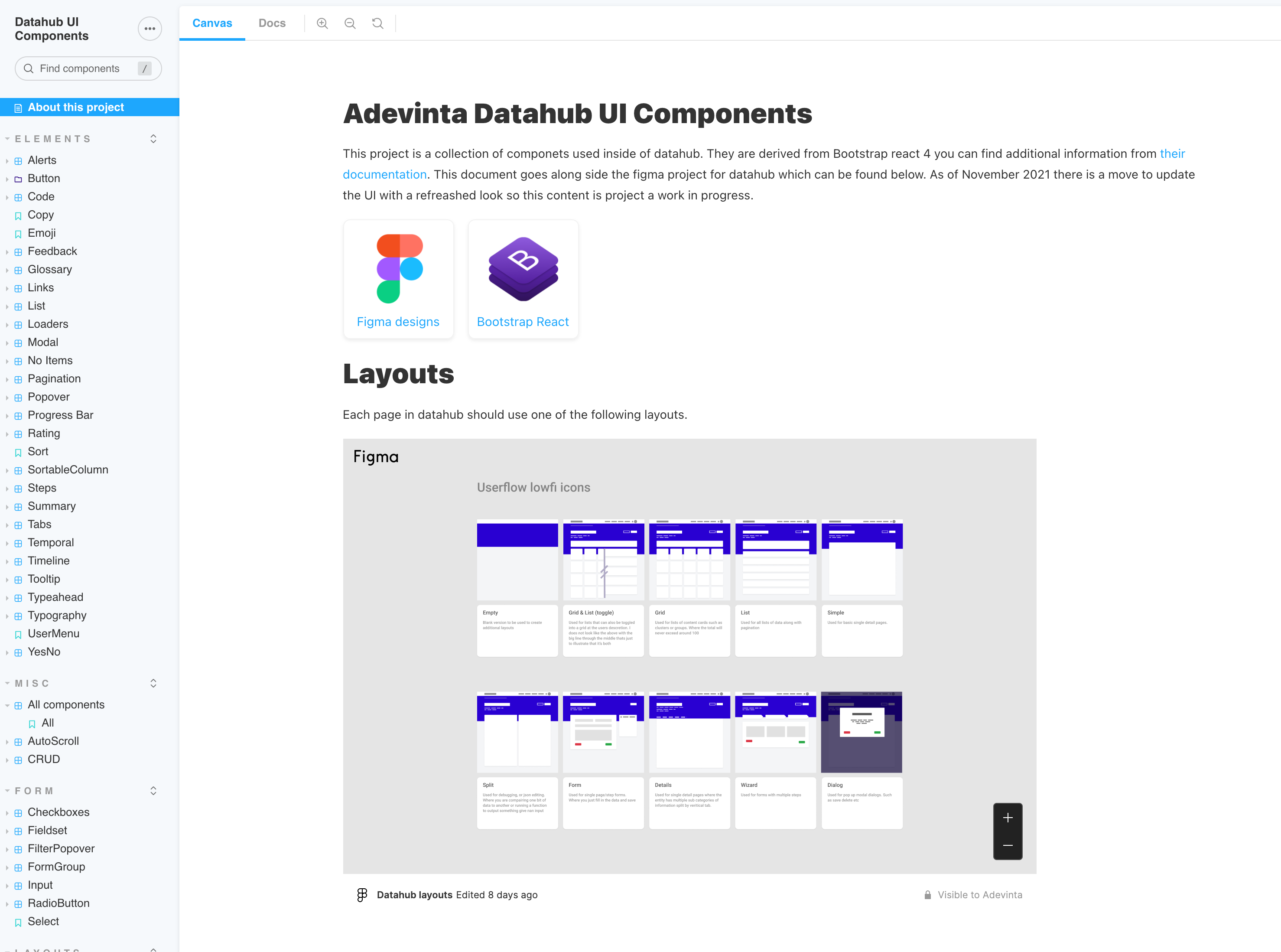
Layouts
Shown below the low-fi layout icons. These can be used as a new Figma page design starting point and also as icons in visual sitemap wireframes where designing new routes.
- Empty State
- Wizard (shown below)
- Grid & list (toggle)
- Grid (if the toggle is not desired)
- List (if the toggle is not desired)
- Simple single main section
- Split columns
- Form
- Details & Submenu
- Dialog
Detailed example of the “Wizard layout”
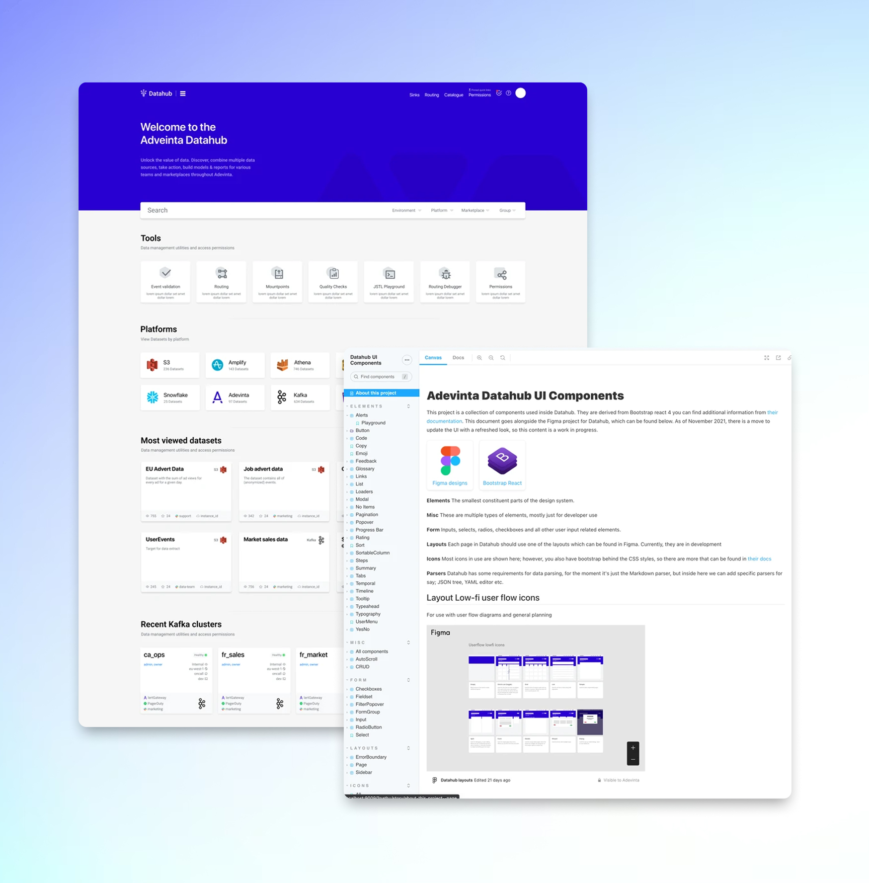
Design System
Along side the Design updates to the platform I took all the work from Figma and updated their Storybook design system. In the screenshot below you can see that provides standard layouts to use along side all the optional components. Design tokens & Styles.
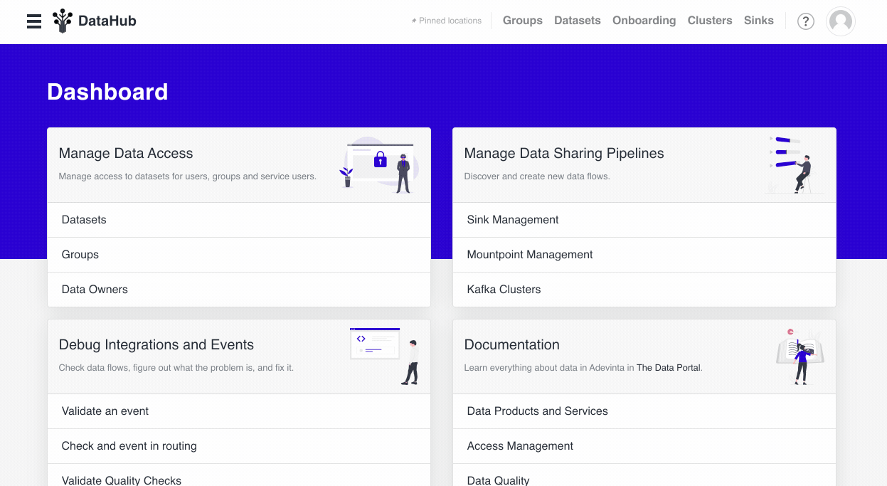
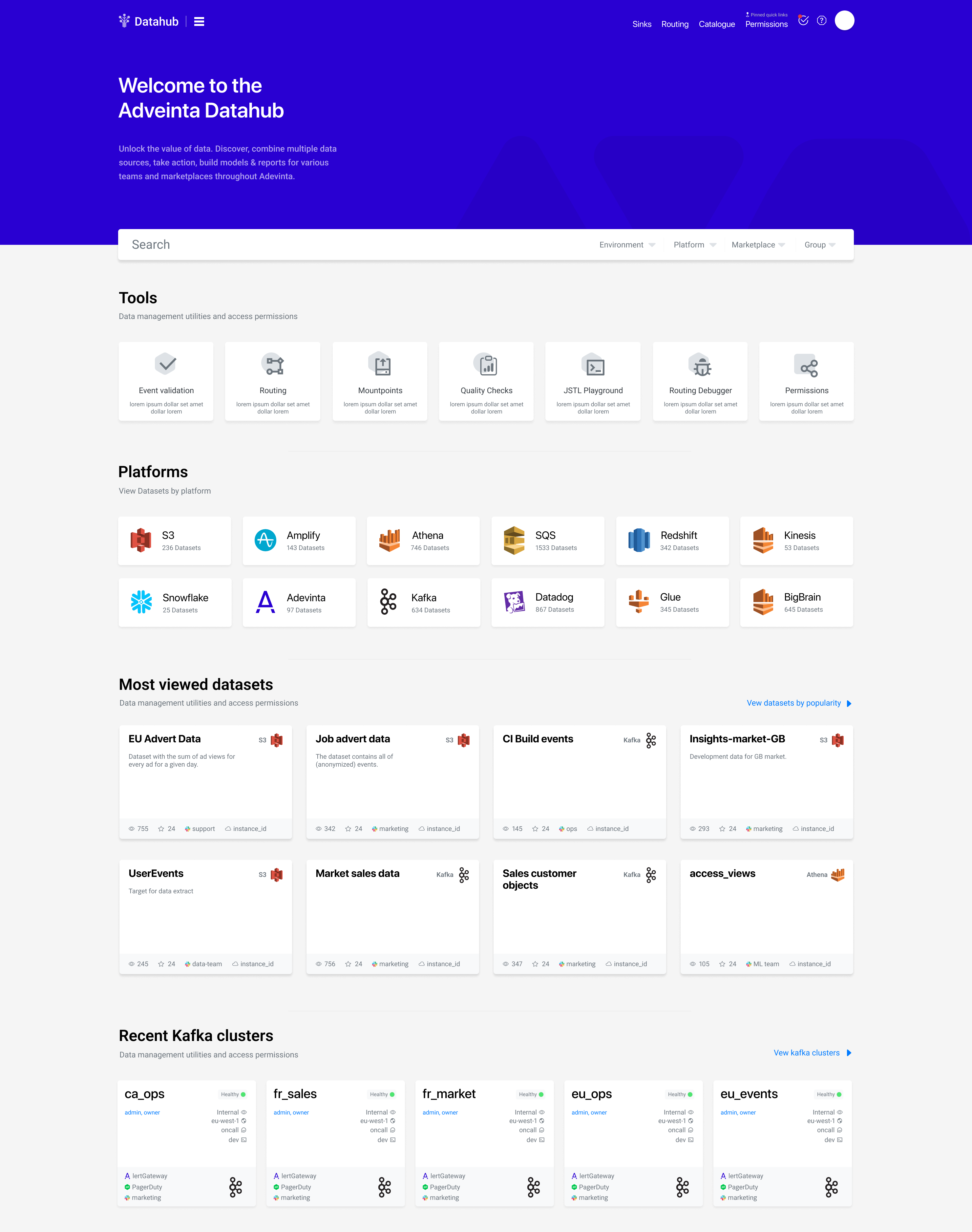
Pulling it all together into the new Index page
One thing i really like about designing applications is that you first put down a solid design system, Colors, Shapes Text Styles, Elements, Menus. Then You can pull out of all of that step back from the canvas and use those assets and the understanding of the platform to develop the overall product. The hardest part in my mind is always some sort of index page/dashboard.
The final design for the platform can be found below. Far better visual structure. Clear different between the features and its, such as tools and datasets. Meta data present but not overwhelming.
Tim Yagan
Senior Engineering Manager @ AdevintaMax was hired as a senior consultant at Adevinta and he was instrumental in optimising the Frontend code and designs for a new data catalogue tool that was being developed by the company. Additionally Max collaborated closely with multiple stakeholders and brought with him good expertise to help the team make strategic decisions for the benefit of the users.
I enjoyed working with Max and I would gladly work with him again!